The Art of the Cheat Sheet: How to Master One-Page Revision Notes
The magic of a one-page revision note isn't just having a compact summary to glance at 10 minutes before an exam. The real power lies in the process of creation.
To squeeze an entire chapter, topic, or unit onto a single sheet of paper, you have to aggressively filter, analyze, and reformat information. It forces active recall and deep processing—the exact opposite of passively highlighting a textbook.
Here is your operational blueprint for compressing massive amounts of information into a single, high-yield mastery sheet.
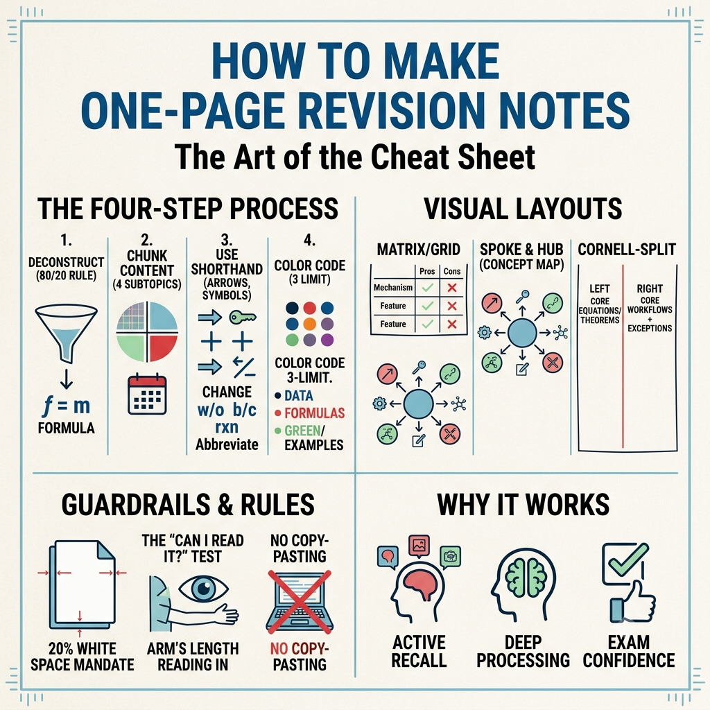
The Four-Step Compression Workflow
Creating a one-page summary requires an intentional transition from consumption to curation. Order matters here: if you try to design the layout while reading the text for the first time, you will inevitably run out of space.
1. Deconstruct and Filter (The 80/20 Rule)
Identify the core mechanisms
Before touching your final sheet, review your primary text or lecture slides. Identify the 20% of the content that drives 80% of the marks. Look for core formulas, definitions, foundational frameworks, and common exam traps.
Rule of thumb: If a piece of information can easily be deduced logically from another concept already on the page, leave it out.
2. Chunk Content Chronologically or Conceptually
Divide the page mentally before writing
Count your key subtopics. Most single-page layouts fail because Step 1 bleeds into half the page, leaving no room for the rest. If you have 4 main subtopics, your page layout must explicitly carve out 4 distinct quadrants or columns.
3. Translate to Shorthand and Visual Elements
Never write full sentences
Sentences are the enemy of space. Convert verbs, transitional phrases, and qualifiers into symbols.
Use arrows (\rightarrow) for causal relationships or processes.
Use mathematical operators (+ or \Delta) for additions or changes.
Abbreviate heavily (e.g., w/o for without, b/c for because, rxn for reaction).
4. Color Code with Strict Intention
Limit yourself to three colors max
Do not turn the sheet into a coloring book. Use a structural color system:
Color 1 (Black/Dark Blue): Main data, concepts, and shorthand.
Color 2 (Red/Orange): Critical formulas, exceptions to rules, and highly tested pain points.
Color 3 (Green/Purple): Examples, keywords, or structural dividers.
Visual Frameworks: Choose Your Layout
The shape of your content should dictate the shape of your notes. Do not default to standard linear lines. Instead, use visual mapping or structural blocks to create spatial memory anchors.
Choose from three foundational layout structures depending on your subject matter:
1. The Matrix/Grid Layout
Best for comparative subjects (e.g., contrasting different economic policies, historical eras, or biological kingdoms).
* How it works: Divide the page into a uniform grid using thin lines. Each block represents a single entity. Force yourself to use identical sub-headings within each block (e.g., Mechanism, Pros, Cons, Classic Example) to allow your brain to compare across categories instantly.
2. The Spoke and Hub (Concept Map)
Best for systems-based subjects where everything is interconnected (e.g., ecology, complex literature plots, or macroeconomics).
* How it works: Place the core theme dead-center. Radiate major branches outward, getting increasingly detailed as you reach the edges of the page. Use thick arrows to cross-reference between completely separate branches to emphasize systemic relationships.
3. The Cornell-Split Variant
Best for problem-heavy or formulaic subjects (e.g., physics, calculus, financial accounting).
* How it works: Draw a vertical line down the page at the one-third mark.
* Left Column (33%): Core equations, laws, and foundational theorems.
* Right Column (67%): Step-by-step generic problem-solving workflows, edge-case exceptions, and high-frequency mistakes to watch out for.
Guardrails for True Single-Page Success
To keep your revision sheet functional rather than chaotic, stick to these non-negotiable constraints:
> The White Space Mandate: At least 20% of your page must remain completely blank. If your page is a wall-to-wall block of microscopic ink, your brain will experience cognitive overload when looking at it. White space acts as a visual buffer that helps your eyes navigate the content under stress.
>
* The "Can I Read It?" Test: Hold your finished sheet at arm's length. Can you clearly distinguish the headers and main sections? If it looks like a gray blur, your hierarchy failed. Next time, use larger fonts for headers and bolder lines for section breaks.
* No Copy-Pasting: Never copy sentences verbatim from a slide or textbook. If you can't rephrase a concept into your own shorthand, you don't understand it well enough yet to put it on your sheet.
By treating the page limit as a strict boundary, you turn studying into a game of strategy: determining what actually matters most.
Keep learning
Explore more HB StudyHub resources
Use notes, PDFs, previous papers, and the study planner to apply what you learned.